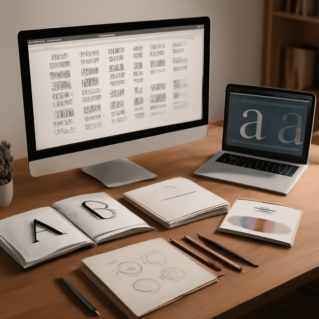
Typography plays a crucial role in creating visually appealing and easily navigable web environments. It goes beyond mere aesthetics, serving as a strategic tool to enhance user experience and effectively convey information. Grasping the principles of typography is essential for crafting engaging and readable content.
The Importance of Typography in Web Design
Typography is more than just choosing a font; it's about organizing text in a way that aligns with your overall design goals. Good typography helps maintain the website’s tone and aids in readability, ensuring that users can easily consume the information presented.
Key Typography Principles
-
Legibility and Readability
Legibility refers to how easily individual characters and letters can be distinguished from each other. Choosing a clear and uncomplicated font enhances legibility. Readability, on the other hand, concerns how easy it is for users to read and understand text. Consider appropriate text size, line height, and letter spacing to improve readability.
-
Font Choice
When selecting fonts, aim for a balance between creativity and clarity. Combining well-matched fonts can add interest, but avoid using too many different types to prevent a cluttered look. Many designers opt for web-safe fonts to ensure consistency across different devices and browsers.
-
Hierarchy and Structure
Establishing visual hierarchy guides users through the content. Use different font weights, sizes, and styles to indicate levels of importance. Headings, subheadings, and body text should be distinct, easily directing the user’s eye where it needs to go.
-
Consistency
Consistent typography across a website helps users familiarize themselves with its structure and flow. Consistent style choices, such as font sizes for headings and paragraphs, contribute to a cohesive appearance and enhance the site's professionalism.
-
Contrast
Use contrast in typography to make important text stand out. This can be achieved through different font weights, colors, or sizes. Ensuring adequate contrast between text and its background improves readability, especially on smaller screens.
-
Alignment
Proper alignment of text creates a neat and organized appearance, improving visual appeal and readability. Avoid excessive justification, which can lead to awkward spacing creating a visually jarring effect.
-
Whitespace
Whitespace, or negative space, is the area surrounding text and elements. It helps create breathing room, preventing the design from feeling overwhelmed. Adequate whitespace guides users' focus and emphasizes the content.
Implementing Typography in Design
When integrating typography, start with a wireframe to plan the structure and information hierarchy. This helps visualize how various typography elements will interact within the design. Tools like CSS allow for detailed control over typography, enabling designers to customize aspects like font size, weight, and style.
Understanding and implementing typography principles is key to successful design. Effective typography not only enhances visual appeal but also plays a significant role in communicating the message a digital space aims to deliver. By concentrating on legibility, consistency, and hierarchy, designers can create engaging content that resonates with users and enhances their web browsing experience.